
In these last few months there has been some slow and steady progress on the site’s design. I thought I had it more or less nailed down, but due to feedback from friends and my own growing discontent I went back for more!
Header Graphics
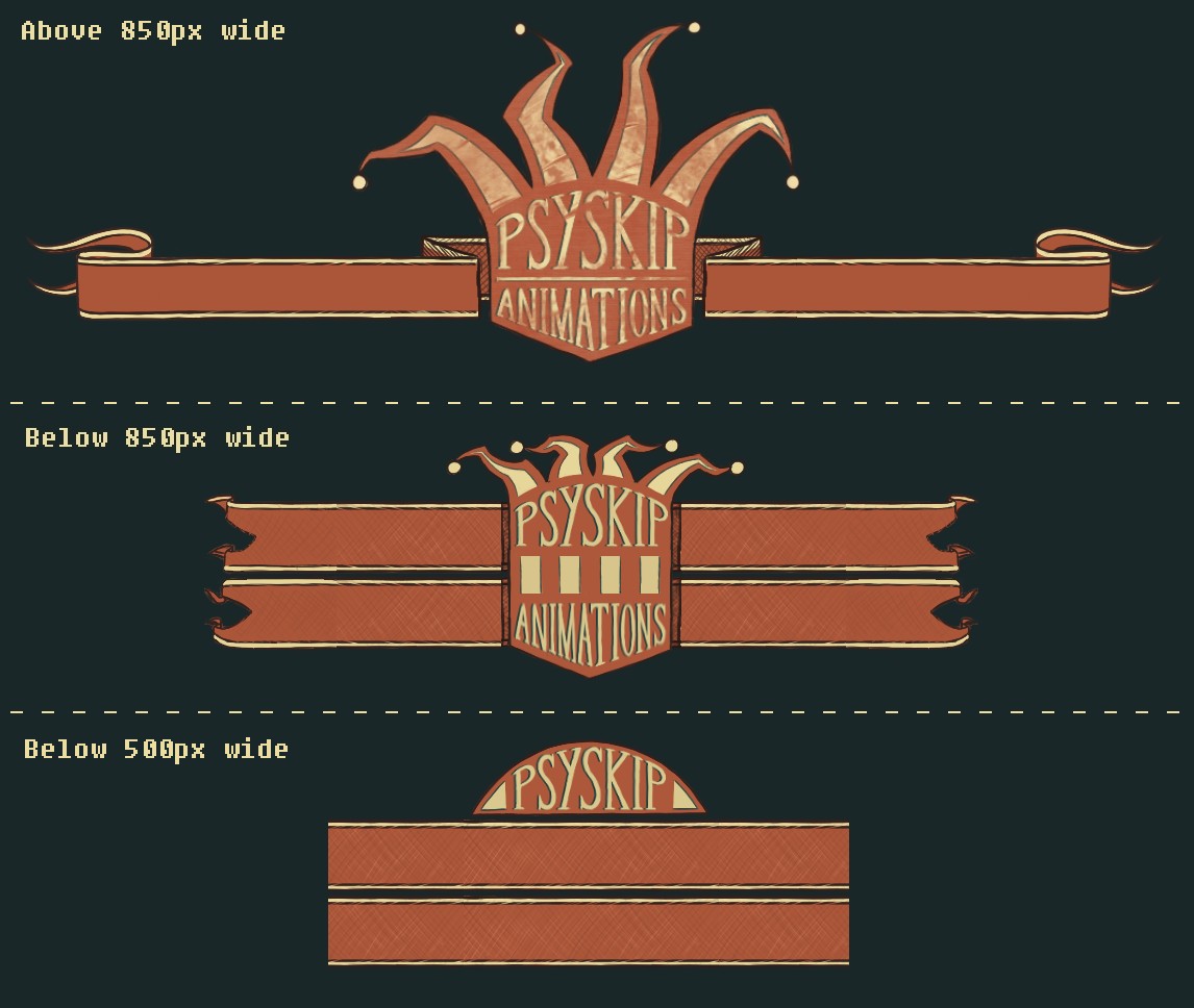
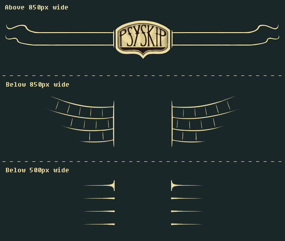
Making the header for this site has been a long lived frustration for me. At first I wanted the site navigation to be handled with a flashy, animated flash embed (to any experienced web developers reading this – please don’t laugh), then I wanted a large painterly mural that incorporated the main menu and after that I settled with a grungy, carnival sign-post look… until I realized I wasn’t capable of making it look good, especially on those pesky mobile devices.
The new header/menu design I’ve currently settled for is quite simple and as a result reads far more clearly on every device size. The only thing that’s been retained from the previous design is the central ‘PSYSkip’ logo that’s displayed on larger devices, but that has also been simplified and edited to fit the new look. With a few small tweaks and perhaps a SVG conversion I think this site header will do nicely.
Showreel Graphics
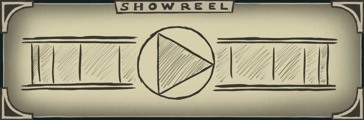
To watch my showreel users were previously required to click on an image that opened a lightbox containing an embedded video. Unfortunately most of my testers didn’t know to click on the image and completely missed the video, despite the image itself taking up quite a lot of front page screen space; space that wasn’t used meaningfully since the video appears in a lightbox.
I’ve now replaced that implementation with a more… dynamic approach to the design. Instead of opening a lightbox the ‘image’ morphs into the video player itself, with some animated curtains added for dramatic flair. The initial image itself is also more compact and emphasis has been added to the play icon to make it look more like a clickable button. I think with a few more tweaks this element will fit quite nicely within the site.
Blog Feed Graphics
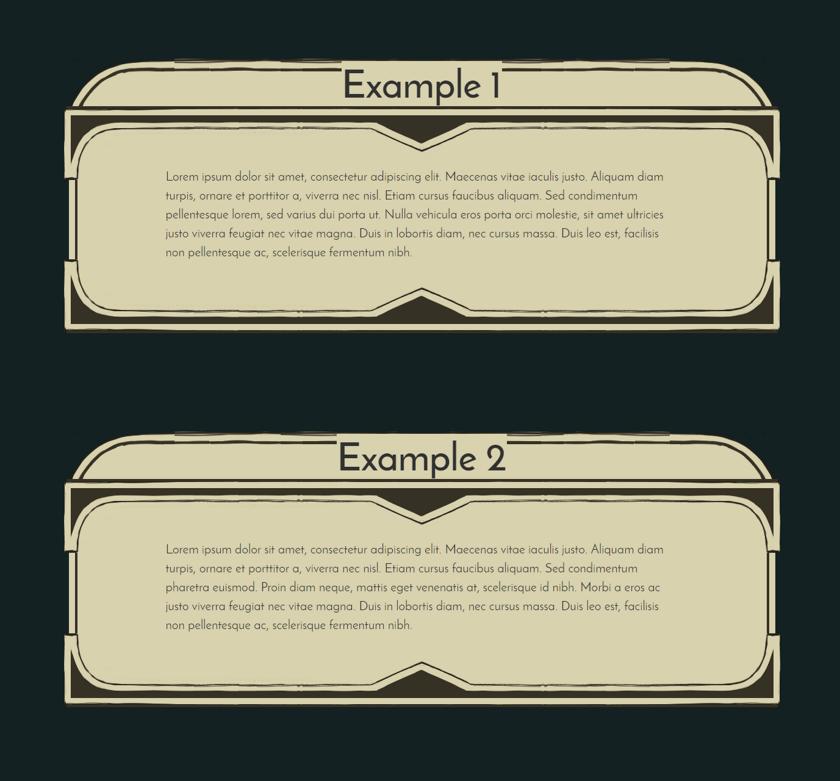
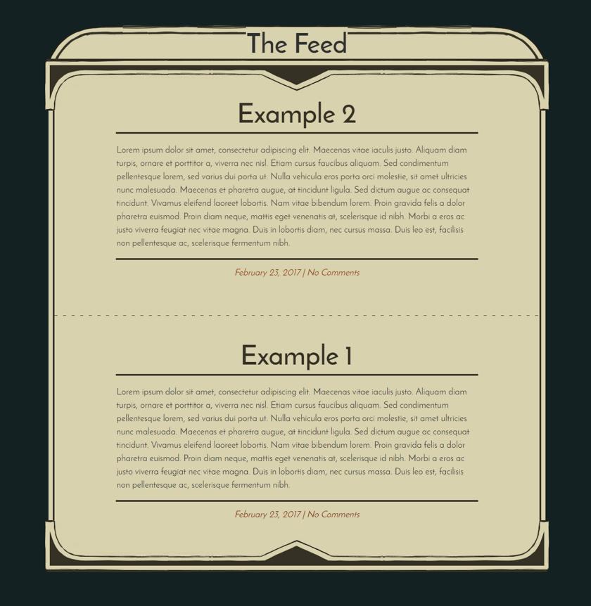
Changing the visual structure of the blog feed came about due to some much needed criticism, plus some observations of my own. The previous design of the blog feed had each post contained on it’s own visually contained ‘page’. This led some users to not scroll past the first post, as it appeared that the feed had ended. The solution for this was relatively straightforward: have the entire blog feed contained on one visual page, with each post separated by a dashed line. This change has also forced me to adapt how I format individual posts, but after I’m done with that the blog feed will definitely feature a much more cohesive, visually pleasing design than before.
That’s it for the really substantial stuff. Over the next month I’ll be replacing the low res placeholders I have now with finalized designs, hopefully figure out how the comment system works, and finally adding some more portfolio content to the site.
Then I think it’s just a matter of combing through the code to see what I can ditch. Happy days!